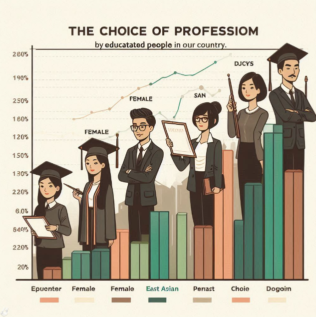
The graph chart shows the choice of profession by educated people in our country
The graph chart shows the choice of profession by educated people in our country. Describe the graph.
The choice of profession by educated people in recent times 70%
The graph below shows Population Growth Rate from 2007 to 2014Farming Buiness Govt Job Research work Banking Teaching
Ans. The graph illustrates the choice of profession by the educated people in recent times. Six categories of jobs are mentioned in the graph these are farming, business, govt. job, research work, banking and teaching. It is observed that govt. job occupies the first position with 60% of the educated people preferring this profession over other service.
Banking career in Bangladesh essay
IELTS এর বেস্ট সব টেকনিক হাতে-কলমে শিখতে কোর্সIn the field of the educated people's choice of their profession, banking has occupied the second position.40% of educated people choose banking as their profession. Unfortunately, the picture is grim in terms of educated people's indifference towards teaching as only 30% of them have opted for this profession.
A pie chart on the choice of professions by different educated people
Business claims the fourth position engaging 20% of the total educated people. Unfortunately, only 10% of the educated people have chosen farming. If the educated people were interested in farming, this sector might flourish rapidly. Finally, the research work occupies only 5% of the total educated people which could well be due to the dearth of research opportunities in our country.
Graduate unemployment rate in Bangladesh
With 60% preference for Govt. Service the educated people of Bangladesh are displaying their inclination towards traditional jobs. Unfortunately, a bleak picture emerges as private sectors have failed to attract the educated people. However, the positive side is that the educated people are showing some fascination for banking
Mobile phone usage statistics worldwide
The graph below shows the number of telephone and mobile phone users. Describe the graph in at least 80 words. You should highlight the information and report the main features given in the graph.
The number of telephone and mobile phone users (in crore)
A recent survey was conducted on the users of telephone and mobile phone during the period of 1998-2011. This span of 13 years has been divided into short periods to indicate the growth rate of telephone and mobile phone users. In 1998 the users were 0241 crore which with a little growth stood at .0283 crore in 2000.
In 2003 it rose up to .1365 crore which certainly indicates a fairly great increase during this span of three years. Two years later in 2005 it reached 9 crore. It is about 6 times higher than that of 2003. In fact, the increasing trend persisted throughout the next eight years. In 2007 and 2009 the users were 3.43 crore and 5.04 crore respectively.
Usage of mobile phones and internet
A great increase is observed here. And in 2011, the number shot up to 8.5 crore surpassing all previous records. These data are indication of people's growing fascination for mobile phones. Actually, the importance of connectivity and cheap prices of these communication devices are the main reasons of its rapid increase.
Impact of mobile phones in daily life
Moreover, these devices have become an inseparable part of everyday life even to the underprivileged section of people. Again, apart from communication purpose, mobile phones are being used for running Internet, face books, Skype and a host of other programmes which eventually triggered the popularity of mobile phones among the people of all strata of the society.

.png)

